A Fresh Start

The Goal
Students were given the ability to completely re-brand any organization of our choice. Given my love for narratives and detective novels, I chose Mystery Writers of America, an organization that recognizes and promotes the work of mystery authors.
Once we selected our organization, our goal was to give it an entirely new identity. For MWA, my aim was to create a more fun and intriguing identity that captured the appropriate "air of mystery".
The Mark
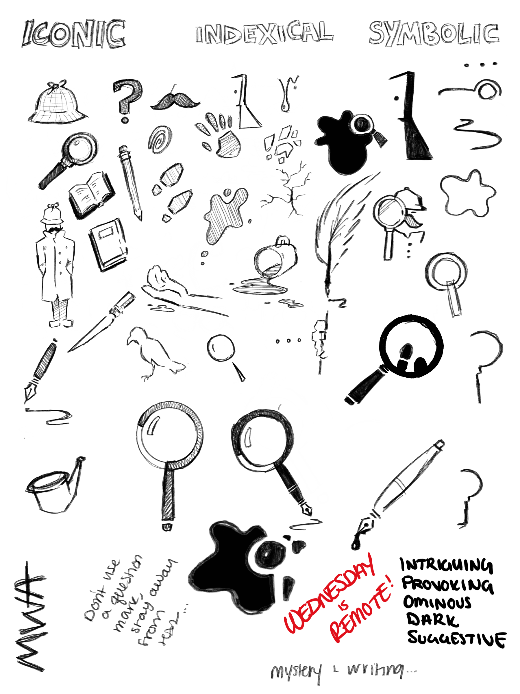
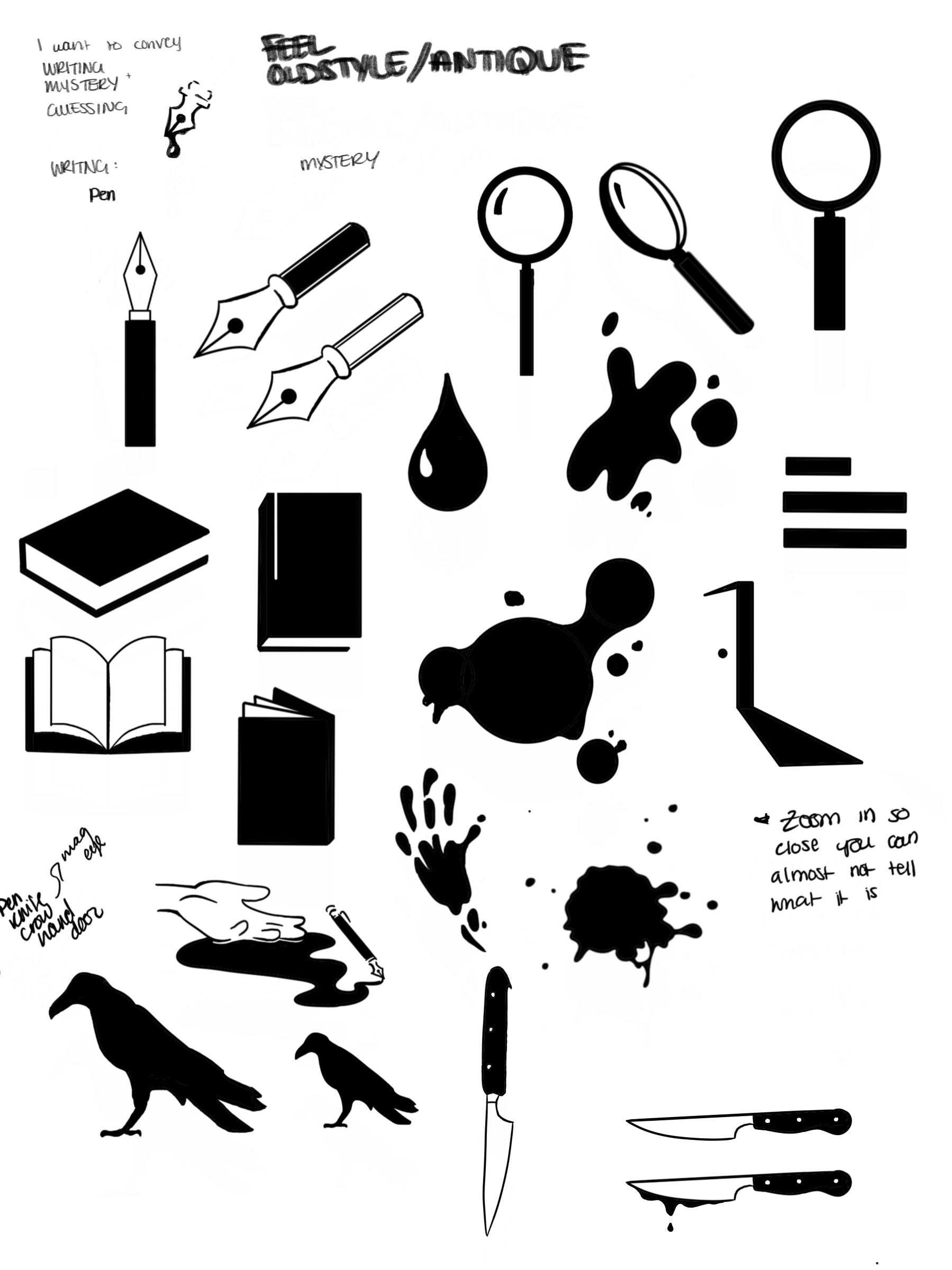
Chapter one explores the creation of the new MWA mark. I constructed the mark using classic mystery imagery: a splatter, a fountain pen, and a subtle magnifying glass.
The sketches:
The finalists:


...and the winner:
The final mark was constructed using a blend of classic mystery imagery: a splatter, a fountain pen, and a subtle magnifying glass, like small clues hinting at the meaning of the organization.

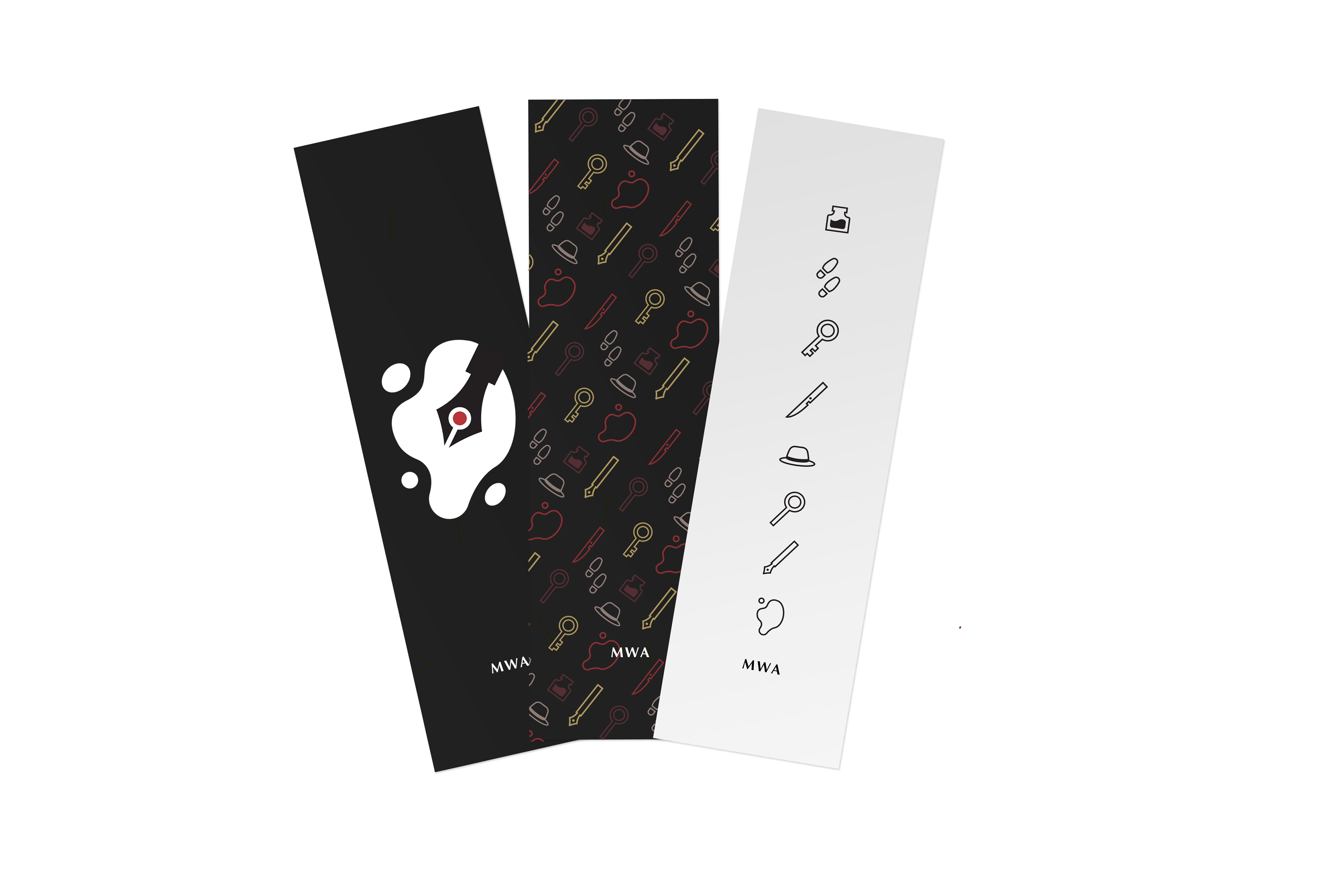
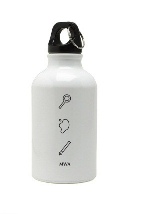
Iconography
The icon system pulls from other classic mystery tropes to further build upon the the intriguing look and feel of the brand. These icons are used to assist in navigation on digital platforms, and become key elements to the brand identity.


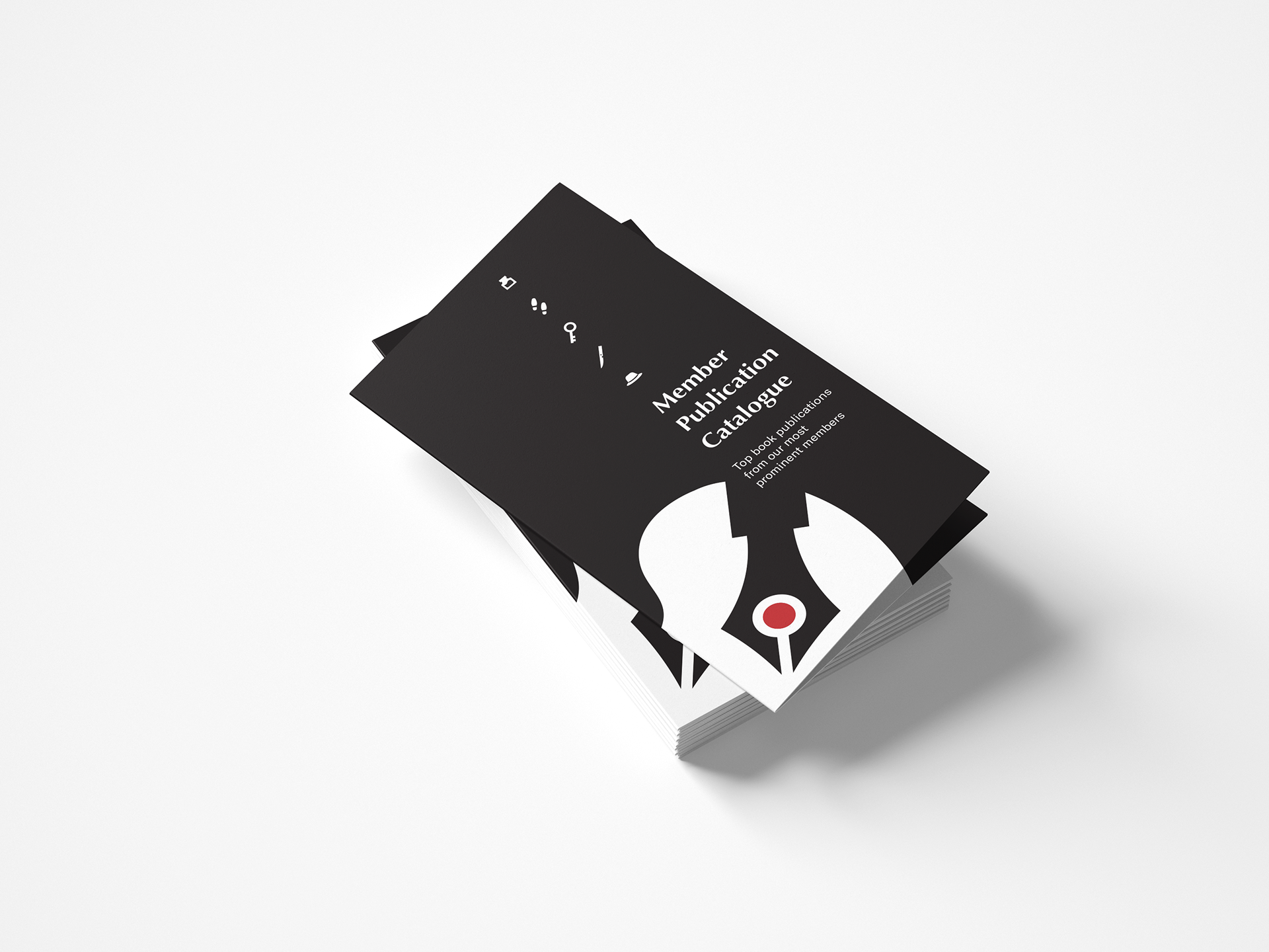
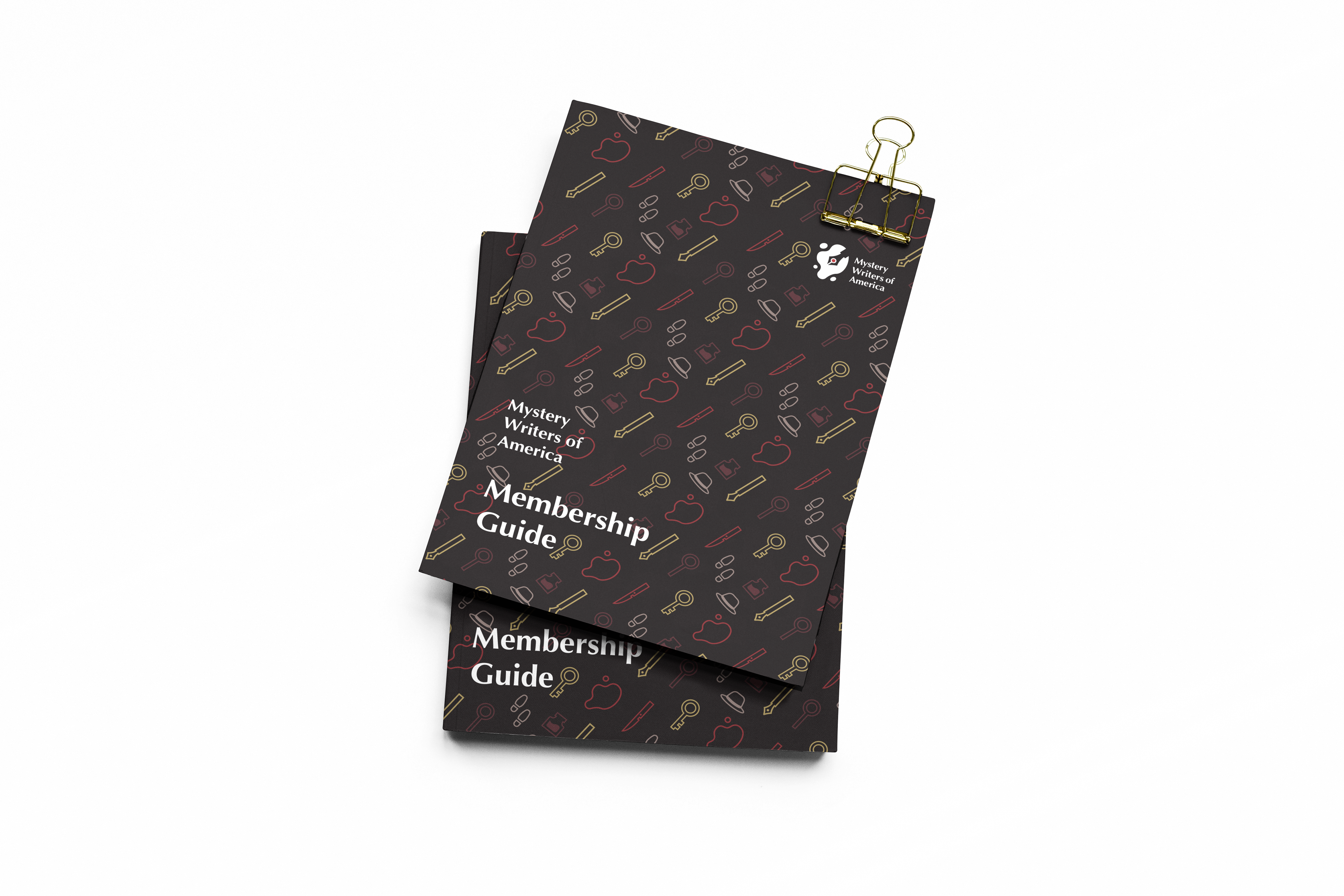
Extensions
The full identity is established as the mark, icons, and deep color palette are incorporated into all MWA material, including the website, programs, and merchandise.


Full Process Documentation
Check out the full process and all final deliverables below. Thank you!